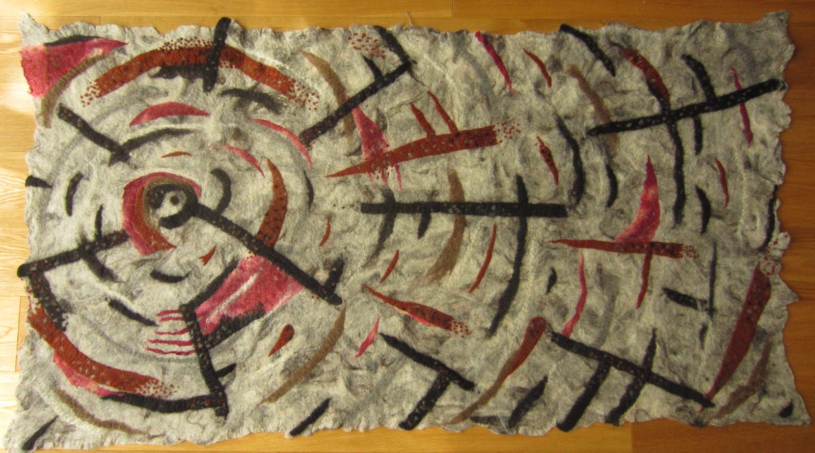
I finally plucked up the courage to work on my monster “alien signpost” piece again, needle felting some details into the surface and fulling it. It spent yesterday blocked on some children’s play mats and drying in the lovely weather we have had this weekend. I blocked it face down to ensure the face was not distorted by the hanging sleeve on the back. This is what it looks like now:
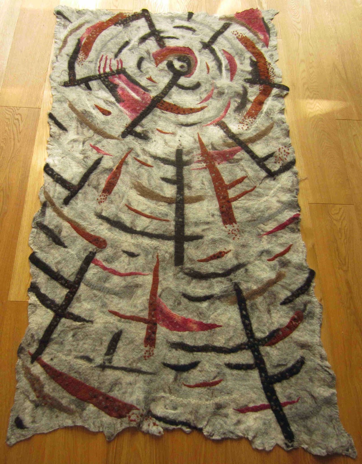
If I trim it, I expect it to look something like this:
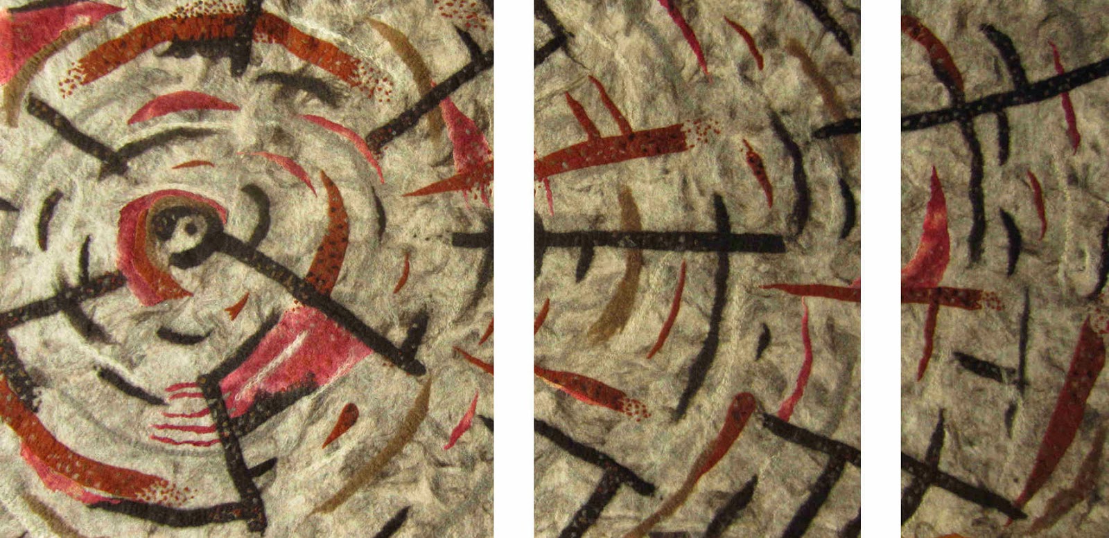
And as a triptych –
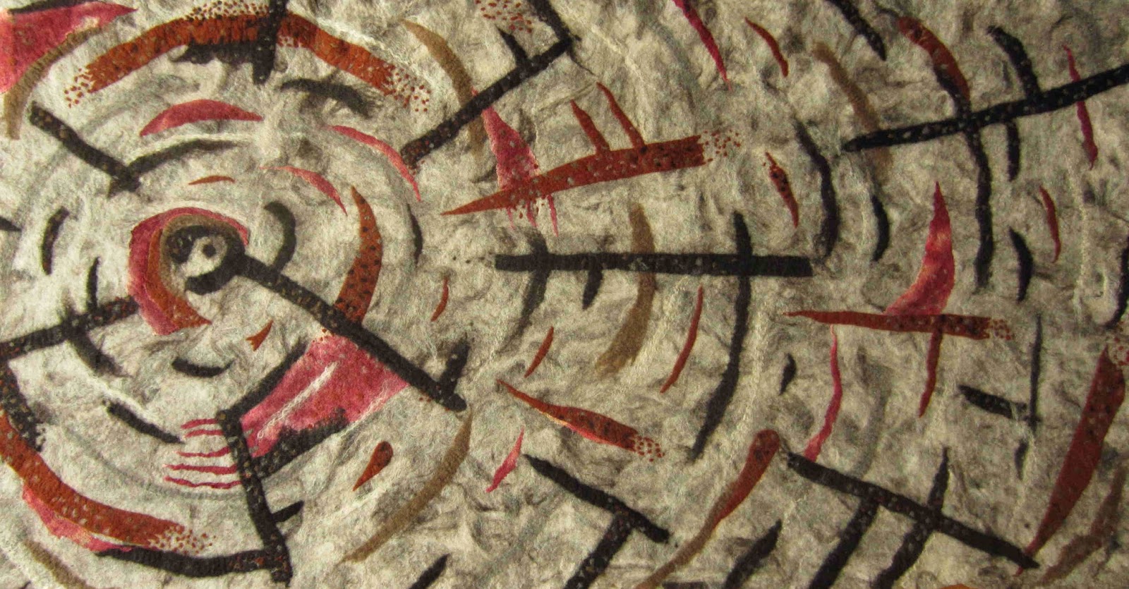
Version 1 landscape:
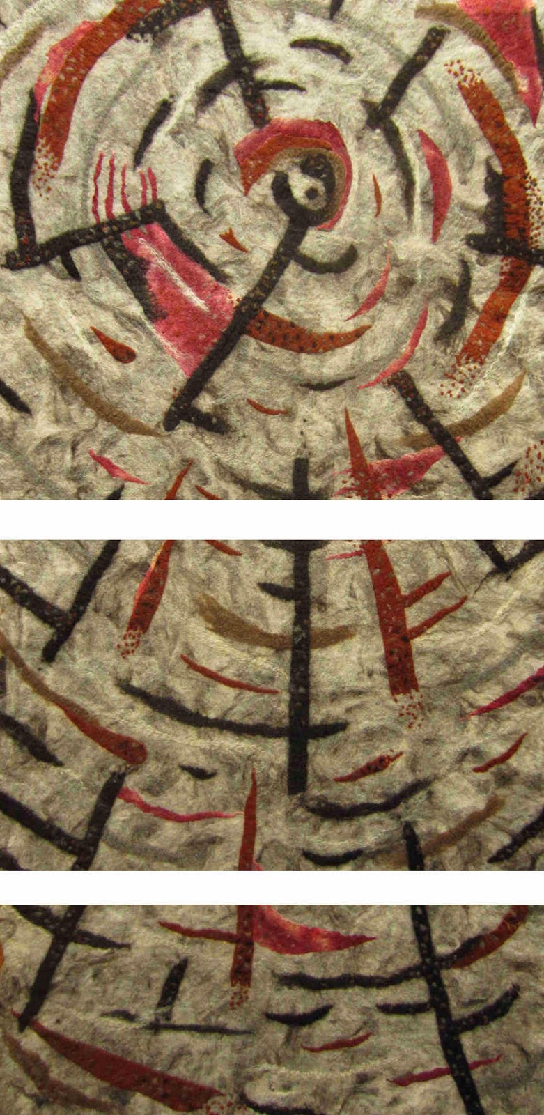
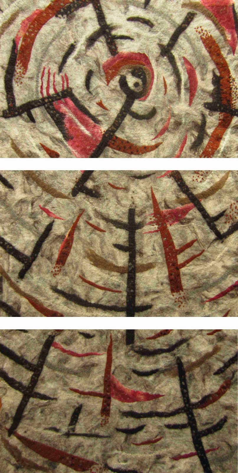
Triptych version 1 portrait:
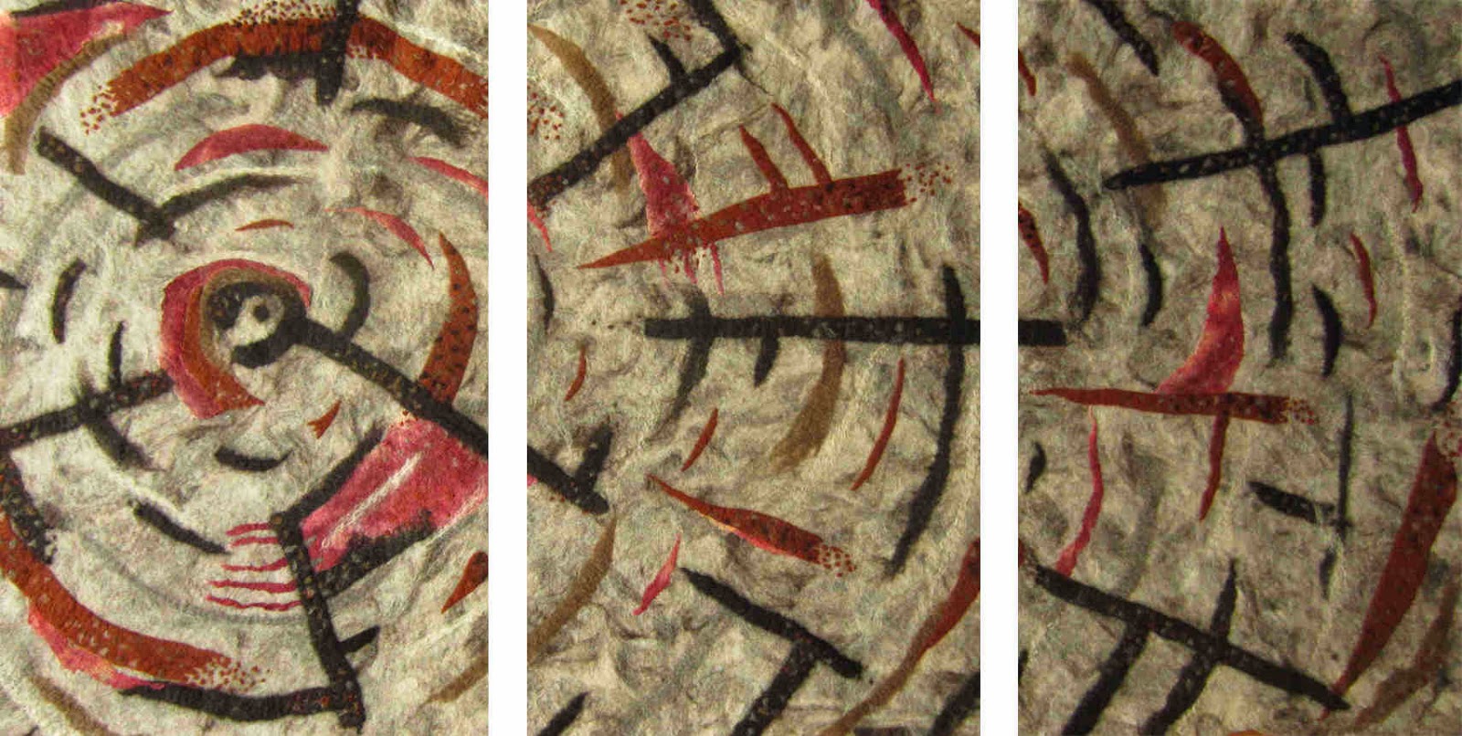
Triptych version 2 landscape:
Triptych version 2 portrait:
I am racked with indecision about where to go with this piece. What do you think? Do you prefer the portrait or landscape orientation? Which of the triptychs is most aesthetically pleasing? Or should I scrap the triptych idea altogether and revel in the torn paper effect?

I like them all , but I think I like the vertical torn paper effect the best. It seems to draw me into the centre most . Lovely work.
I like them all , but I think I like the vertical torn paper effect the best. It seems to draw me into the centre most . Lovely work.
Every thing is very interesting! I would prefer triptych v.1 landscape, but it's of course up to you as an author!
Every thing is very interesting! I would prefer triptych v.1 landscape, but it's of course up to you as an author!
I think you should leave it a while and then go back with fresh eyes. That usually helps me make a decision. That said, I like the landscape orientation best and version 1 of the triptych. How would it look if you added a "matte" around the triptych pieces of black or red?
I think you should leave it a while and then go back with fresh eyes. That usually helps me make a decision. That said, I like the landscape orientation best and version 1 of the triptych. How would it look if you added a "matte" around the triptych pieces of black or red?
Thank you all for your thoughtful reviews, that's good advice Ruth. I will try to leave it be for a few more days but it looks like it will be either the entire panel in the vertical format or the V1 triptych landscape (which was my original plan before I started). That is an interesting idea for the mount board too – I hadn't considered that due to the size of it but as a triptych on 2 different boards that might be possible…. photoshop here I come (again) 🙂
Thank you all for your thoughtful reviews, that's good advice Ruth. I will try to leave it be for a few more days but it looks like it will be either the entire panel in the vertical format or the V1 triptych landscape (which was my original plan before I started). That is an interesting idea for the mount board too – I hadn't considered that due to the size of it but as a triptych on 2 different boards that might be possible…. photoshop here I come (again) 🙂
I too like the version 1 landscape triptych. But do whatever you think is best, especially after looking at it for a while longer. The answer will come to you!
I too like the version 1 landscape triptych. But do whatever you think is best, especially after looking at it for a while longer. The answer will come to you!
Hi Terry, lunatics ???? would be okay I think ;-))
Sorry I missed a lot, but am catching up !
I agree with jane that the torn paper effect is great ! But as Ryth says,
leaving it for some time works for me as well … 😉 good luck.
Your machine stitched cat is wonderful and I love yout cards
Hi Terry, lunatics ???? would be okay I think ;-))
Sorry I missed a lot, but am catching up !
I agree with jane that the torn paper effect is great ! But as Ryth says,
leaving it for some time works for me as well … 😉 good luck.
Your machine stitched cat is wonderful and I love yout cards
Difficult because I do like the "torn paper edge", but I would favour version 1 landscape. I have no idea why except it pleases my eye.
Difficult because I do like the "torn paper edge", but I would favour version 1 landscape. I have no idea why except it pleases my eye.
Hahaha…and I like it horizontally as one piece with the 'torn edge' at the right. (I guess that goes to show that however you hang it, it will be spectacular!!)
Hahaha…and I like it horizontally as one piece with the 'torn edge' at the right. (I guess that goes to show that however you hang it, it will be spectacular!!)