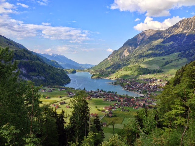
This week I spent 3 fabulous days in Switzerland, in the beautiful Interlaken area surrounded by awe inspiring mountains, shimmering lakes and the sound of cow bells. I only wish I could have stayed longer.
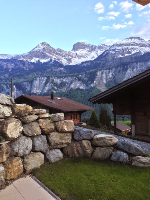
This was the view from my chalet:
My reason for going was not the beautiful scenery though, I was there to attend a workshop with Yvonne Habbe. What a workshop it was too! My head is still spinning with incredible ideas that her methods have revealed.
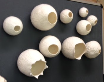
Initially we were set the task of making a perfect sphere, these are some of our efforts:
The title of the workshop was “Seedpods” and was focussed on creating 3D forms, here are some examples of her work that sparked my desire to attend this workshop:
Amazing aren’t they?
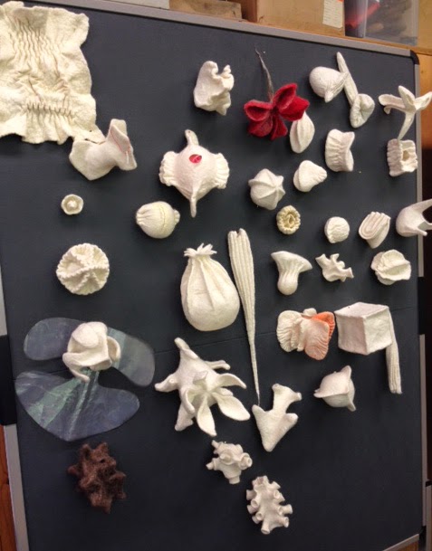
It was a slightly unusual workshop in that we really only spent a couple of hours over the 3 days watching Yvonne demonstrate her techniques, the rest of the time was spent exploring. I am so grateful for finding myself surrounded by such a fantastic group of students, with everyone enthusiastic to share their discoveries at the end of each day. It was revealing to see all the different approaches that we took. Here are a few of our collective works:
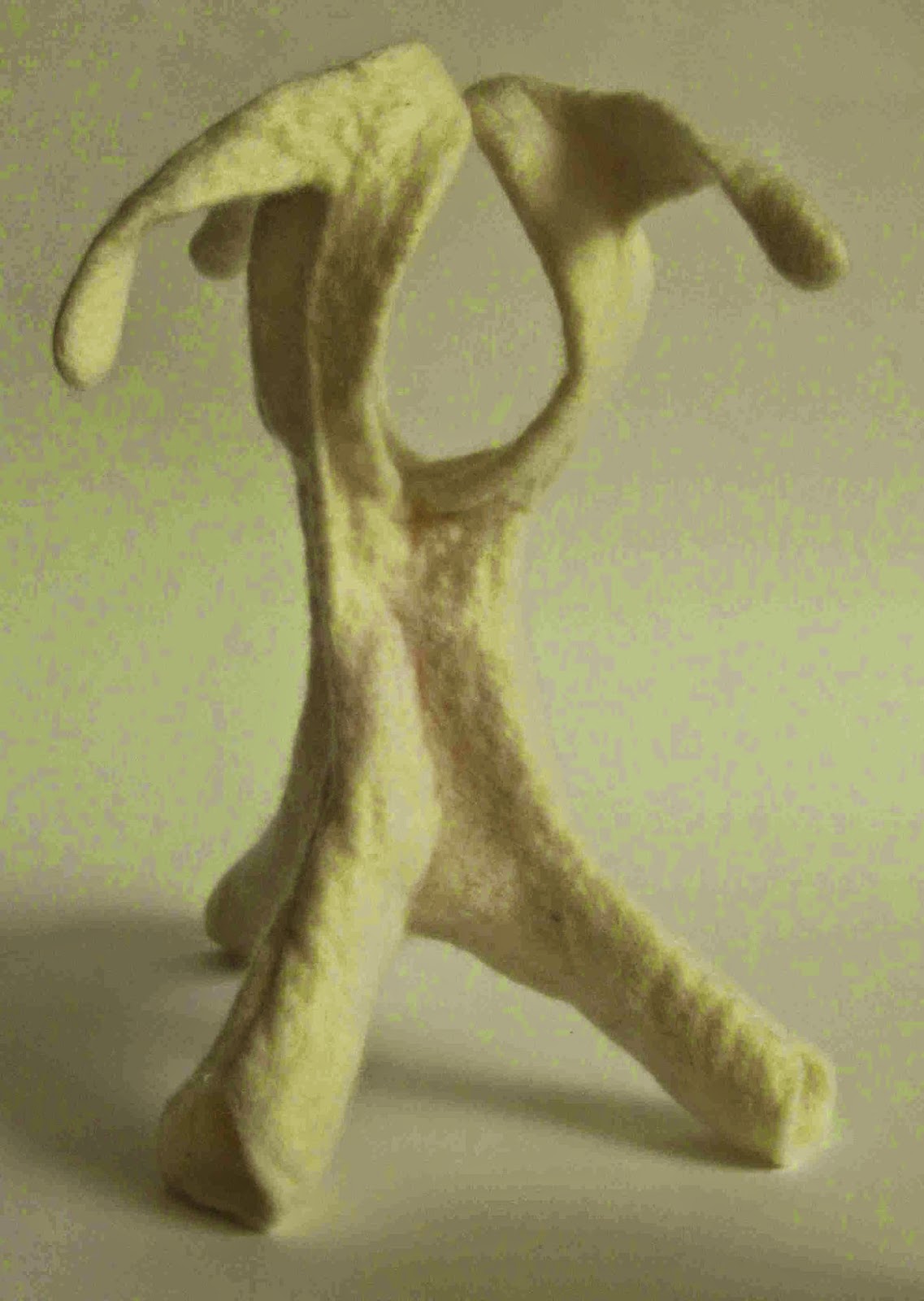
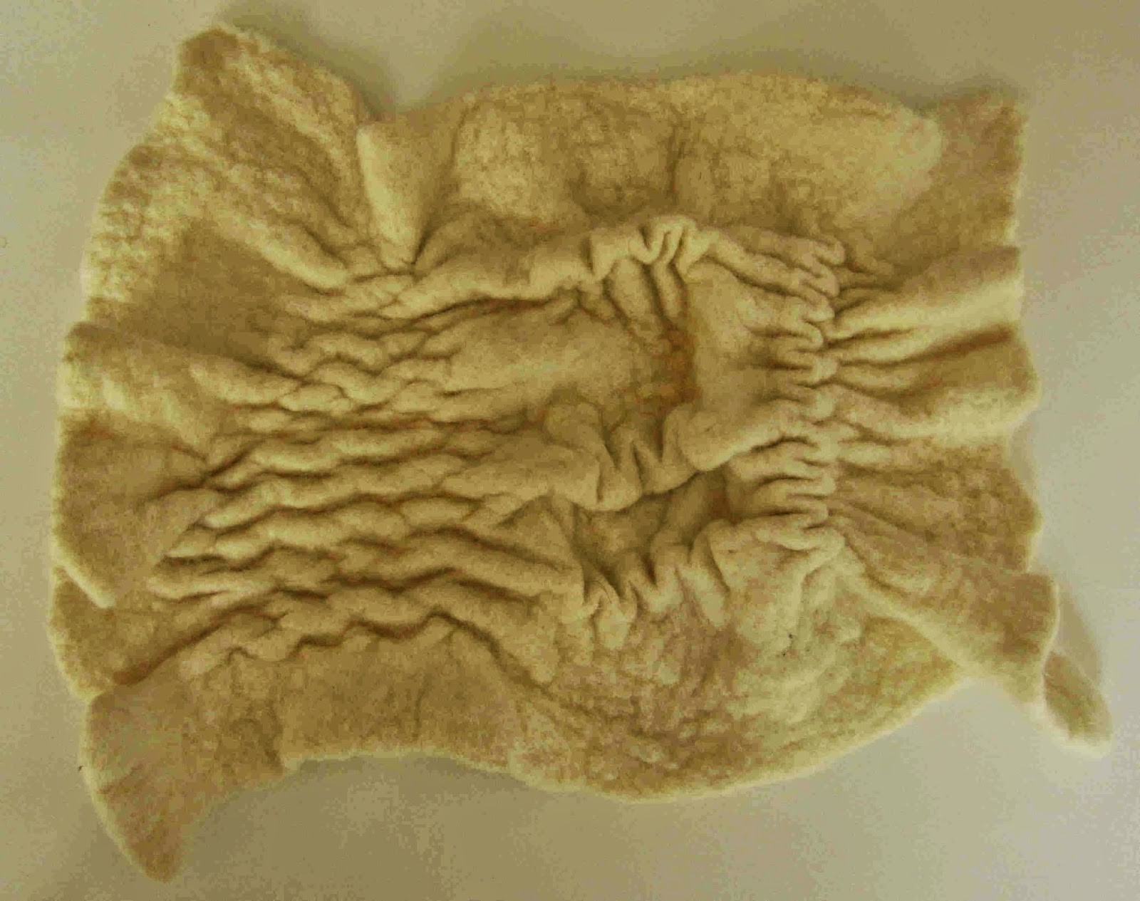
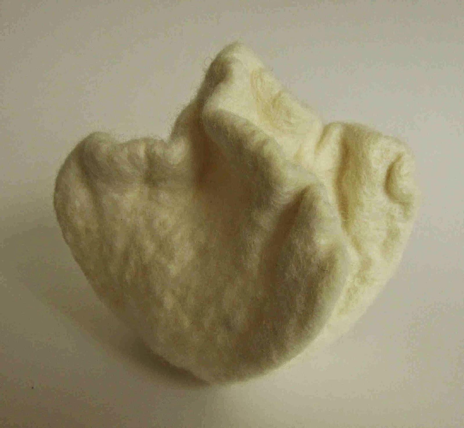
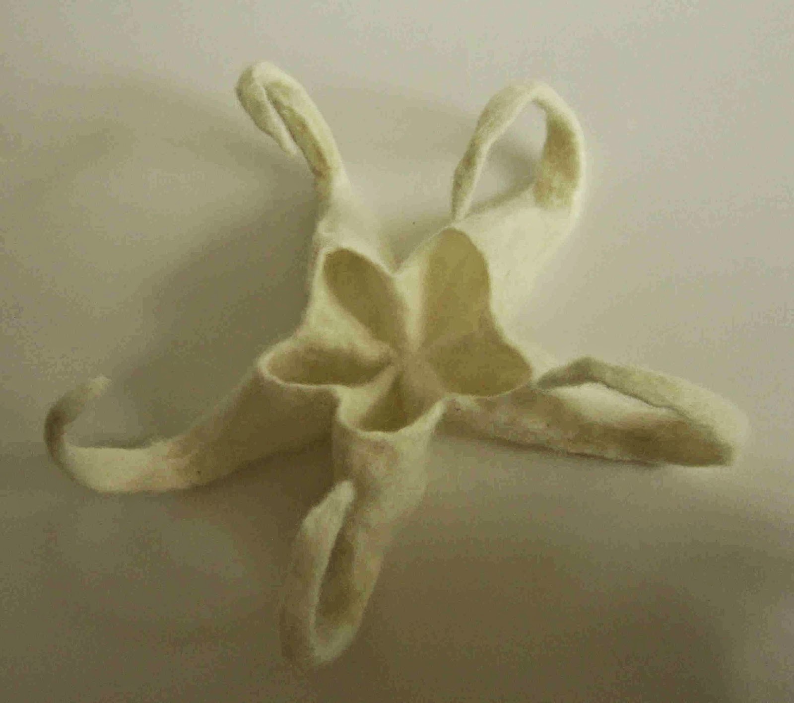
And these are a few of my favourite pieces that I created:
The next step is to dye some of these pieces but I will save that post for another day. 🙂
These pieces are primarily sculptures but I also have a few ideas for some unusual bags that I am itching to try out…. watch this space!
Linking up to nina-marie, off the wall Friday

