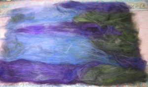
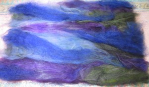
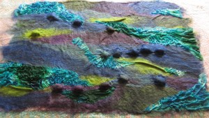
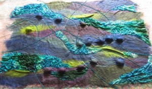
The lovely ladies at the Felting and Fiber Forum recently posted the third quarter challenge. I confess I have been a bit rubbish at completing these this year, although I did give some thought to the Q2 challenge and thankfully Q2 and Q3 are similar enough that I can transplant my idea from Q2 to the Q3 challenge.
I wanted to make a textural wall hanging using silk cocoons to add some extra dimension a bit like this but on a larger scale:
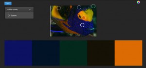
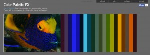
This quarter’s challenge is focussed on colour and we are to use the colours selected from a photo or image as seen by a colour selector program in a textile piece.
This is the image I chose, Mr TB took it on one of our Sipidan dives and 6 years on, it is still one of my favourites (one day I will get around to making a more literal interpretation of it in felt):
I ran the photo through 2 programs:
Colour Adobe

Palette FX
Of the two I much prefer the wider range of colours from Palette Fx so dyed some silk, yarn and cocoons alongside blending some merino and Norwegian wools on the drum carder in an effort to match 9 or 10 of the colours.
The results of the dyeing was interesting, I threw a mixture of materials into each bag filled with dye and acid solution expecting them to come out looking very similar.
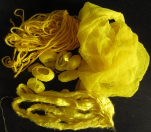
Well the yellow did, only the yarn is a slightly deeper intensity:
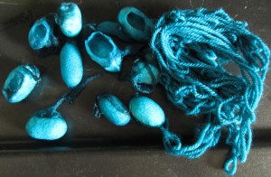
And the cyan was similar, although again, the yarn is a stronger /deeper colour.
But the orange/brown gave me a complete range, the silk top and cocoons were the lightest and really quite orangey, while the silk chiffon is more of an orangey-brown colour, while the yarn is bordering on chestnut brown. Quite a range…. all from the same bag.
Is this just down to the light reflecting qualities of each material or do you think they are interacting (chemically) with the dye in different ways?
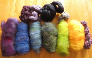
Here is the result of all the blending too, I’m including a couple of balls of merino that are similar to the colours generated by Palette FX and found a skein of sari yarn in my stash that is very similar to the purples. Not sure if it will make it into the final piece but I certainly have quite a range of fibres to play with 🙂
I’m really looking forward to putting the blue (second from left) with the yellowy-orange (second from right. They are complimentary on the colour wheel and of similar intensity so I’m expecting them to really make each other sing.
Now I just need to figure out how to assemble this wonderful pile of fluff into something interesting to hang on the wall…..
