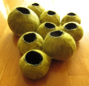
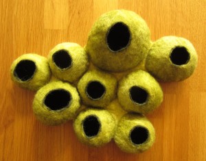
Last week I started exploring binding techniques for a new wall hanging I have in mind, my idea is to create a confluent layer of cells, organically spreading across the wall, this was my first experiment, the pods were made individually and attached to thin layer of felt to join them together:
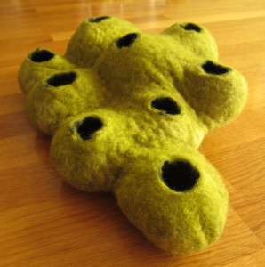
In this version all the resists were covered in a single layer of wool on each side, as predicted, serveral of the “pods” have merged into one mega pod with several holes:
This layout was much quicker and the resulting effect is much more amorphous – the individual pods blend almost seamlessly into each other.
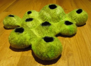
My final experiment was a blend of the 2 methods above, the resists were individually covered with black wool before covering all of them in a continuous layer of green wool.
While the pods are less discrete than in the first experiment, the individual forms are more defined than in the second experiment.
I’m leaning towards the technique from first test sample for the final piece, simply because it lends itself towards using a different coloured base and it will be much easier to make “accent” cells of a different colour.
What do you think? Which version would you prefer to see?


I like the first one best (top of the post), where you made individual pods, and that method would give you more colour options.
Thank you Lyn, it looks like everyone agrees, number 1 is the winner!
I like the first one the best. As Lyn says you’d have the most options with colors this way. Also, I like the definition of each individual cell.
Thank you Marilyn, I am looking forward to picking out a single cell in a complementary colour as a focal point 🙂
Yes I too prefer the first pods but both sets are wonderfully done.
Thank you Jeanette 🙂
I also really like the first one – it reminds me of a wasp’s nest. I think you’ve got fabulous tenacity for doing each experiment to find the right fit!
Oooh, now that wasn’t a connection I hadn’t seen…. wasps nest. Perhaps a needle-felted insect crawling out of one the cells is a way forward. Thanks Cath!
Well I guess I have to be the odd one out. I like the combination of the techniques because it looks more organic. More cell like as opposed to neat pods on a background. But that’s just one opinion since most everyone else likes number one.
Thanks Ruth, as you say maybe a combination of the 2 methods would be interesting 🙂